

Stanford Medicine Children’s Health
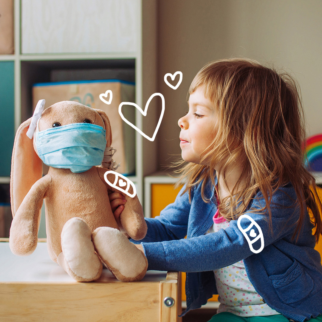
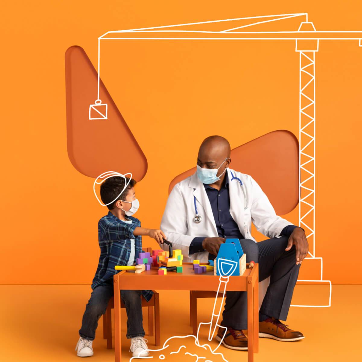
After 4 years of producing the incredibly successful “Access to Excellence” Campaign, we decided it was time for a change. Actually, quite a few changes. There was a name change, a new strategy to explore, and a desire to refresh the look without losing all the things that made it stand out. And so, a new campaign was born, with the same bright colors, quirky sense of humor and playful, friendly attitude.


When you have a campaign that’s defined by its delightful visual style, it’s kind of daunting to imagine radio to accompany it, but we think we pulled it off pretty nicely.
No it's not
:30
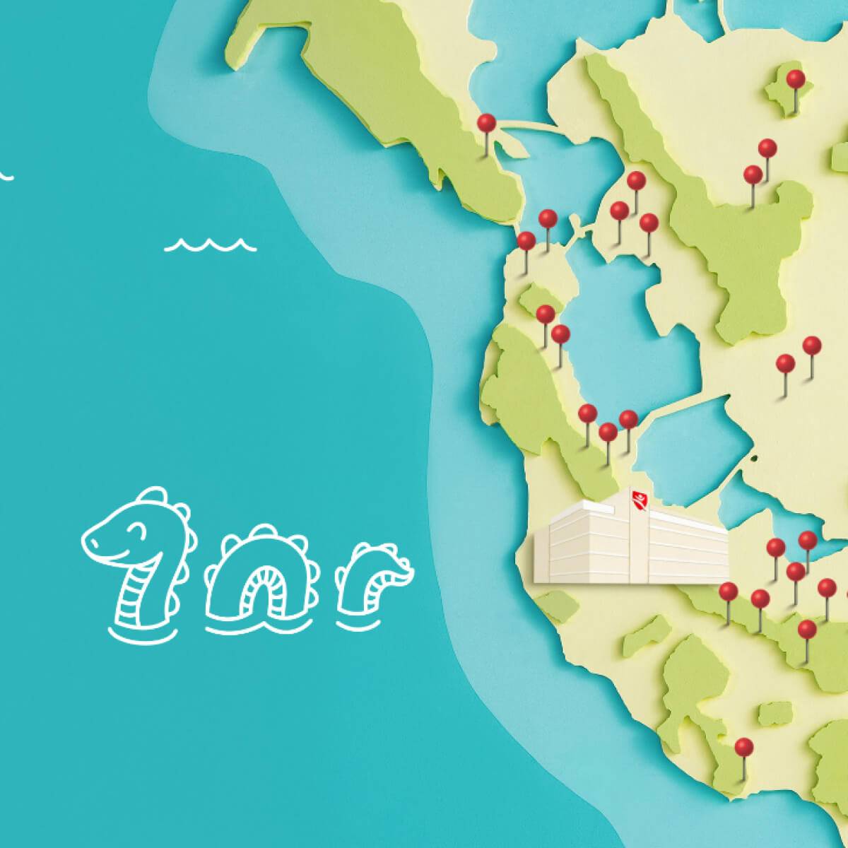
Locations
:15
When we looked at what other brands were running on social, we noticed that most were either repurposing existing ads, or trying to blend in with other content long enough to trick people into watching. We didn’t want to do either of those things. So, we challenged ourselves to create something original, that was fun and entertaining, but clearly branded.

Talking Baby was created specifically for TikTok, where the audience tends to gravitate toward slightly quirkier content.
Maps was geo-targeted to specific communities around the Bay Area.
Here we took some user-generated content and added the Stanford illustrations and messaging. FYI, no kids were injured in the making of these videos…we hope.
The insight behind this campaign? Google almost any question about kids and it will auto populate with an even weirder one.


Fifteen Seconds
:15
Things you don't want your kids to access
:30
Same Story
:15
